Studio Guide · Updated August 2026
How to Scan Artwork for Prints: The Settings and Workflow That Work
A painting sells once. A good scan of it sells as prints forever. Here is the exact settings and file workflow for digitizing paintings, drawings, and watercolors at reproduction quality.
By the Austin Gallery editors · August 19, 2026
The whole workflow in six lines
- Clean the glass, dust the art, lay it face down and square on the bed.
- Scan at 600 dpi (enough to print up to 2x the original size).
- Set 48-bit color and turn off every auto-correction: sharpening, color restore, dust removal.
- Color correct on a calibrated monitor, matching the scan to the original by eye.
- Save the corrected file as a TIFF master and never touch it again.
- Export sRGB JPEGs for the web and per-printer files from that master.
Everything below expands on those six lines: the gear, the settings that actually change print quality, the adjustments for each medium, and what to do when the artwork is bigger than the scanner. If you are still choosing hardware, start with our full guide to the best scanners for art, then come back here for the workflow.
What you need
A flatbed scanner, the software that came with it (or the free VueScan trial or your OS scanning utility), a microfiber cloth for the glass, a soft brush for the artwork, and disk space. That is the whole kit. The scanner is the only real decision, and the right one depends on what you make and how big you work:
Scanner tiers we recommend
Prices verified August 2026. Affiliate links; we may earn a commission, at no cost to you.
 Canon CanoScan LiDE 400 (~$97)The cheapest scanner that does the job. A4 flatbed, USB powered, fine for sketches and sharing work online.View on Amazon →
 Epson Perfection V39 II (~$119.99)Our budget pick for flat art. Everything in this guide works on this scanner, and it earns its keep on the first print run.View on Amazon →
 Epson Perfection V600 (~$599.99)Adds film and transparency scanning to a capable flatbed. The step up if negatives and slides are part of your archive.View on Amazon →
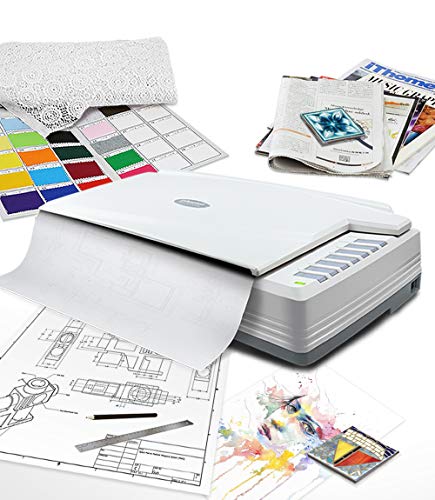 Plustek OpticPro A320E (~$649)A 12 x 17 inch bed. Scans most quarter-sheet watercolors and mid-size drawings in one pass, no stitching.View on Amazon →
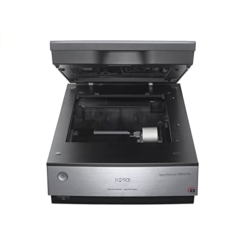 Epson Perfection V850 Pro (~$1,999)The pro flatbed for originals you plan to reproduce and sell. Deep tonal range holds washes and shadow detail consumer units flatten.View on Amazon →
 Epson Expression 12000XL (~$3,990)The A3 graphic-arts scanner print studios buy. One-pass reproduction scans of pieces up to 12.2 x 17.2 inches.View on Amazon →
For most artists digitizing flat work on paper, the V39 II is the answer: it is the budget pick in our scanner rankings and the one we point beginners to first. We cover it in depth in our Epson V39 II review. If your archive is mostly old photographs rather than original art, the priorities shift a little; our photo scanners guide covers that side.
The scanner settings that matter
Scanner software buries the three settings that decide print quality under a pile of one-click enhancements. Set these three and ignore the rest.
Resolution: match the dpi to the print size
Resolution is a means to one end: at least 300 dpi at the size you will print. Work backward from your largest intended print and you get a simple table:
| Scan at | Good for | Note |
|---|---|---|
| 300 dpi | Print at the same size as the original | The baseline print resolution. Fine if you will never enlarge. |
| 600 dpi | Enlarge up to 2x the original | The sweet spot for most artists. An 8 x 10 original prints cleanly at 16 x 20. |
| 1200 dpi | Archival master, large enlargements | Scan once, print any size later. Files run into the hundreds of megabytes. |
| Above 1200 dpi | Rarely worth it | Consumer flatbeds stop resolving real detail; you get bigger files, not better prints. |
When in doubt, scan at 600 dpi. It covers a same-size print with headroom, covers a 2x enlargement at full quality, and the files stay manageable. Scan at 1200 dpi when the piece is leaving your possession, when it is fragile, or when you want one archival master you never have to redo.
Bit depth: 48-bit color, always
A 24-bit scan records 8 bits per color channel; a 48-bit scan records 16. The print itself does not need 16-bit color, but your editing does. Every levels move, white balance fix, and color adjustment throws away tonal information, and an 8-bit file starts showing banding in smooth washes and gradients after a couple of edits. A 16-bit file shrugs those edits off. Scan in 48-bit, edit in 16-bit, and convert to 8-bit only when you export the final JPEG.
Turn off every auto-correction
Auto sharpening, auto color restore, dust removal, backlight correction: all off. These features are tuned for faded snapshots, not art. Auto sharpening invents edge halos that look terrible enlarged. Color restoration shifts your palette toward what the software thinks a photograph should look like. Dust removal can smear fine pen lines and paper texture it mistakes for defects. You want the flattest, most honest capture the hardware can produce; every improvement happens afterward, in editing, where you can see it and undo it.
Scanning by medium
Watercolor
Watercolor is the medium flatbeds were born for, with two catches. First, the paper white: your eye reads the sheet as white, but cold-press paper is usually warm, and the scanner records that honestly. Set the white point from a clean margin of the paper during editing so the print reads the way the original does. Second, texture: the scanner lid pressing the sheet flat against the glass lights the tooth of the paper evenly, so texture renders subtly rather than dramatically. That is usually what you want for reproduction. Pale washes live in the top of the tonal range, which is exactly where 48-bit capture and a no-auto-corrections scan pay off.
Graphite and ink
Scan drawings in color, not grayscale mode, even for black and white work. A color scan captures the warmth of the paper and any subtle tone in the medium, and you can convert to neutral grayscale in editing with full control. Let the scanner make that decision and it is gone. The one real problem with graphite is sheen: dense pencil areas are slightly reflective and can read lighter than they look in person. Keep the lid fully closed for even pressure, and if a dense passage still scans light, correct it locally in editing rather than darkening the whole file.
Acrylic and oil
Paintings are where scanning starts to lose to photography. A flatbed needs the work flat on the glass, so stretched canvas is out unless the painting is on a panel or unstretched sheet, and impasto texture confuses the scanner's shallow depth of field while the lid cannot close evenly over thick paint. Panels and thinly painted works up to bed size scan beautifully. For everything else, a camera on a copy stand with even lighting is the right tool: our artwork photography gear guide covers the full setup, and our camera guide for photographing artwork covers the bodies and lenses worth buying for it.
When the artwork is bigger than the scanner
An A4 flatbed scans up to roughly 8.5 x 11.7 inches, and a lot of art is bigger than that. You have three options, in escalating order of cost.
Stitch multiple scans. Scan the piece in overlapping sections, with 30 to 40 percent overlap between passes, and keep the artwork in the same orientation for every section: slide it across the bed, never rotate it, so the lighting direction stays consistent. Then merge the sections in stitching software. Photoshop's Photomerge does this well, and free panorama stitchers handle scanner sections just as capably since the geometry is simpler than a handheld panorama. Stitching works reliably up to about four sections; past that, alignment errors and edge seams start costing more time than the scan is worth.
Buy a bigger bed. If you regularly work at half sheet or A3 sizes, stitching every piece gets old fast. A 12 x 17 inch bed like the Plustek A320E covers most mid-size work in one pass, and the A3 Epson 12000XL is the full print-studio answer. We compare every option in our large format art scanners guide.
Use a scanning service. For oversized pieces you digitize once, a professional service with a large-format or drum scanner is cheaper than any hardware. Expect to pay per scan, ask for a 16-bit TIFF at 300 dpi or better at full size, and confirm they handle original art rather than just documents. This is the right call for a handful of large works; the wrong call if scanning is part of your weekly routine.
Color correction basics
The scan on your screen has passed through two interpretations: the scanner's sensor and your monitor's rendering. Correcting color without controlling both is guesswork. The fixes, in order of impact:
Set the paper white. Use the white point tool on an area of clean paper in the scan. Most of what people describe as a color cast in scans is really an uncorrected white point.
Calibrate your monitor. An uncalibrated screen quietly shifts everything you see, so every correction you make bakes the opposite error into the file. A hardware calibrator pays for itself with the first print run that comes back matching the screen. Our photo editing monitor guide covers displays worth correcting on, and our color management guide for artists walks the whole chain from scan to print.
Compare against the original. Put the artwork next to the screen under consistent daylight or a daylight-balanced lamp and adjust until they agree. Your eye comparing the two is a better instrument than any automatic tool.
Soft-proof before printing. Soft-proofing previews the scan through the color profile of a specific printer and paper combination, so you see roughly what the print will do to your colors before spending ink. It is a preview, not a guarantee, but it catches the big surprises: saturated blues and violets dulling, deep shadows blocking up. Your editing software's proof view plus the paper maker's ICC profile is all it takes.
File handling
The master is a TIFF. Save the corrected scan as a TIFF, uncompressed or with lossless LZW compression, at full resolution and bit depth. This file is the asset; a print of it can sell for years, so treat it like the original. Never overwrite it, never crop it destructively, never let a JPEG version become the best copy you have.
Derivatives are exports. From the master, export an sRGB JPEG around 2000 pixels on the long side for web listings and social, and whatever file each print service or printer asks for. If a derivative is wrong, delete it and export again; the master never changes.
Organize like you mean to find it. One folder per artwork, named consistently: title, year, and a masters subfolder separate from exports. Back the masters up to at least one drive that lives somewhere other than your studio. The scan archive is the digital half of protecting your work; the physical half, the sleeves and boxes the originals live in, is covered in our archival art storage guide.
Printing your scans
A reproduction-grade scan deserves a reproduction-grade print. If you are printing in-house, a pigment inkjet is the standard for longevity and color, and our guide to the best home printers for art ranks the ones worth owning. Paper matters as much as the printer: our archival inkjet paper guide covers the cotton rag and baryta sheets that make a scan look like an original. And if you are building this into an actual side business, our print selling starter kit lays out the full pipeline from scan to sale.
Common questions
What dpi should I scan artwork at?
Scan at a resolution that leaves you at least 300 dpi at your largest intended print size. For a same-size reproduction, 300 dpi is enough. To print up to twice the original size, scan at 600 dpi. For an archival master or large enlargements, scan at 1200 dpi. Beyond 1200 dpi you get bigger files, not better prints, because most consumer flatbeds cannot resolve real detail past their optical limit.
Is scanning or photographing artwork better?
For flat work on paper up to your scanner's bed size, scanning wins: even lighting, no lens distortion, and repeatable color. Photography wins for stretched canvas, heavy impasto, glossy varnish, and anything too large to stitch comfortably. Many working artists use both: a flatbed for works on paper and a copy stand with a camera for paintings.
How do I scan a painting larger than my scanner?
Scan it in overlapping sections with 30 to 40 percent overlap, keeping the artwork in the same orientation for every pass, then merge the sections in stitching software such as Photoshop's Photomerge or a free panorama stitcher. It works well up to roughly four sections. Beyond that, a large-format scanner or a professional scanning service is usually the better call.
What scanner do professional artists use?
The Epson Perfection V850 Pro is the standard serious flatbed for artists reproducing their own work up to A4, and print studios that handle larger originals use A3 graphic-arts scanners like the Epson Expression 12000XL. Most artists selling their first prints start on a consumer flatbed such as the Epson V39 II and upgrade only when print sales justify it.
Should I scan in 24-bit or 48-bit color?
Scan in 48-bit color (16 bits per channel) whenever your scanner and software allow it. The extra bit depth holds far more tonal information, which means you can adjust levels, white balance, and color in editing without visible banding. Deliver final JPEGs in 24-bit; that conversion happens at export, after the corrections are done.
What file format should I save art scans in?
Save the master as a TIFF, uncompressed or with lossless LZW compression, in 48-bit color if you scanned that way. TIFF preserves everything the scanner captured. Export JPEGs from that master for web listings and email, and keep the master untouched so every future print run starts from the best version of the file.
Why do my scans look different from the original?
Usually one of three causes: the scanner's auto-corrections altered the color, your monitor is not calibrated, or the paper white was never set. Turn off every automatic enhancement, calibrate the monitor, then set the white point from an area of clean paper in the scan and adjust by eye against the original under consistent daylight.
The bottom line
Scan at 600 dpi in 48-bit color with every auto-correction off, correct on a calibrated monitor against the original, and keep an untouched TIFF master. That is the whole discipline, and it is the difference between a scan you apologize for and a print you can sell. The workflow is the same on a $97 flatbed and a $3,990 one; the hardware just raises the ceiling. When you are ready to choose or upgrade yours, our ranked guide to the best scanners for art is where to start.
Settings in this guide reflect standard reproduction and prepress scanning practice as of August 2026, compiled by Austin Gallery's editors. Product prices verified August 2026 and subject to change. Austin Gallery may earn a commission from links on this page at no cost to you.