Key Takeaways
- Burghild Eichheim-Keller was a German Modernist who developed a distinctive geometric abstraction style
- Her work reflects the Bauhaus tradition of merging art, design, and mathematical precision
- Eichheim-Keller's paintings are gaining recognition among collectors of post-war European abstraction
In the landscape of post-war European abstraction, certain artists carved out distinctive territories through sheer technical mastery and unwavering commitment to their vision. Burghild Eichheim-Keller stands among these figures—a German artist whose color serigraphs from the 1960s represent some of the most refined examples of geometric abstraction produced during that transformative decade.
In This Article
- The Context: Post-War German Art Renaissance
- Early Life and Artistic Formation
- The Serigraph Medium: Technical Excellence
- The Visual Language: Form, Color, and Balance
- Influences and Contemporaries
- The Market for Mid-Century Prints
- Caring for Works on Paper
- Currently Available: Abstract Geometric Composition
Her work embodies the intellectual rigor and formal discipline that characterized the best of mid-century European modernism, while maintaining a warmth and accessibility that sets her apart from more austere practitioners of the geometric tradition.
The Context: Post-War German Art Renaissance
To understand Burghild Eichheim-Keller's significance, we must first understand the extraordinary moment in which she emerged. The Germany of the late 1950s and early 1960s was undergoing a cultural rebirth. The devastation of war had left not only physical ruins but also an artistic void—the Nazi regime had branded modernist art as "degenerate," driving many of Germany's finest artists into exile or silence.
To understand Burghild Eichheim-Keller's significance, we must first understand the extraordinary moment in which she emerged.
As the Federal Republic rebuilt, a new generation of artists sought to reconnect with the modernist traditions that had been suppressed. They looked to the Bauhaus legacy, to international movements like Concrete Art, and to the emerging Zero Group in Düsseldorf, which proclaimed a new beginning—a "Zone Zero" that would clear away the debris of the past.
The Zero Group, founded in 1957 by Heinz Mack, Otto Piene, and later joined by Günther Uecker, declared in their 1963 manifesto: "Zero is silence. Zero is the beginning. Zero is round. Zero spins. Zero is the moon. The sun is Zero. Zero is white. The desert Zero." This spirit of radical renewal permeated German art circles.
Early Life and Artistic Formation
Burghild Eichheim-Keller was born in 1936 in Bad Urach, a picturesque spa town nestled in the Swabian Alps of southwestern Germany. This region, known for its natural beauty and long tradition of fine craftsmanship, would prove formative in shaping her aesthetic sensibilities.
Growing up in post-war Germany, Eichheim-Keller came of age during a period of intense cultural reconstruction. The Wirtschaftswunder—Germany's "economic miracle"—brought not only material prosperity but also a renewed appetite for contemporary art. Museums reopened, galleries flourished, and collectors sought works that represented Germany's reintegration into the international art world.
Eichheim-Keller trained in the rigorous German tradition, developing the technical precision that would become her hallmark. Unlike artists who worked spontaneously, allowing accident and gesture to guide their hands, she approached each composition with the methodical care of an architect or engineer.
The Serigraph Medium: Technical Excellence
Eichheim-Keller's choice of serigraph—also known as silk-screen printing—as her primary medium reveals much about her artistic philosophy. Unlike painting, which allows for spontaneous gesture and correction, serigraphy demands meticulous planning and precise execution.
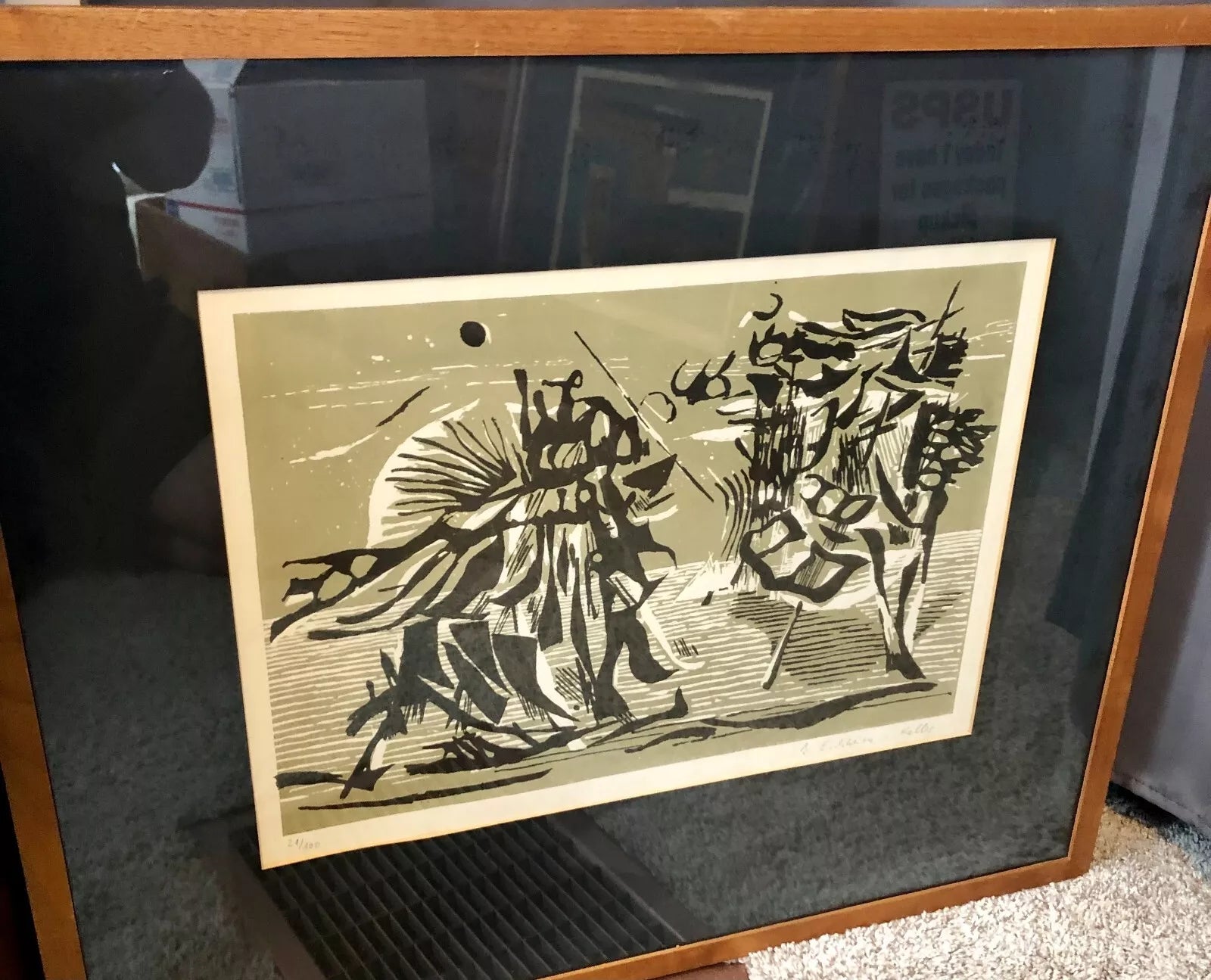 "Abstract Geometric Composition" (1960s) - Signed and numbered color serigraph 21/100. Available in our collection.
The serigraph process requires creating separate screens for each color layer. For a print with five colors, the artist must prepare five screens, each precisely aligned with the others. The ink is pushed through fine mesh onto the paper below, building the image layer by layer. A single misregistration—the failure of one layer to align precisely with others—can ruin an entire print run.
This technically demanding medium suited Eichheim-Keller's temperament perfectly. Her prints reveal an almost mathematical precision in their construction, yet they never feel cold or mechanical. The slight variations inherent in hand-pulled prints give each impression its own subtle character.
The Printmaking Tradition
The serigraph medium has a distinguished history in 20th-century art. Andy Warhol would later make it famous for his Pop Art imagery, but European artists had been exploring its potential for geometric abstraction since the 1950s. Josef Albers, whose "Homage to the Square" series became perhaps the most celebrated exploration of geometric color relationships, worked extensively in print media.
Eichheim-Keller understood that prints offered something paintings could not: the ability to disseminate carefully conceived images to a broader audience while maintaining artistic control over each impression. Each print in an edition is not merely a copy but an original work, signed and numbered by the artist's hand.
Essential Tools for Collectors
The Story of Art by E.H. Gombrich
Essential context for understanding how geometric abstraction emerged from earlier art movements. This classic art history text belongs in every collector's library.
$29.95 | Amazon

The Visual Language: Form, Color, and Balance
What distinguishes Eichheim-Keller's work from other geometric abstractionists of her era is her particular sensitivity to color relationships. While many of her contemporaries worked in high-contrast palettes—bold primary colors against white or black grounds—Eichheim-Keller often employed more nuanced harmonies.