Austin Gallery

Art & Craft

How to Start Calligraphy in 2026: The Complete Beginner's Guide (Supplies + 30-Min Walkthrough + Practice Plan)

Everything to start calligraphy in 2026 — figure out which style to learn first (modern brush vs copperplate vs blackletter), the 4 supplies to buy tonight ($38 total), your first 30 minutes step-by-step, the 5 mistakes that quit 80% of beginners, plus a 90-day practice plan and 18 tested Amazon picks.

By Austin Gallery EditorialMay 24, 202622 min read
An overhead flat-lay of calligraphy supplies on a clean white surface — pointed pen with oblique holder, jar of extra nibs, inkwell, watercolor mixing tray, and a fine brush — arranged around a pristine white sheet of paper waiting for the first stroke.

Photo: Unsplash

Quick Picks

I started calligraphy at my kitchen table 5 years ago with a $4 Tombow Fudenosuke and a sheet of printer paper I'd torn out of my work notebook. The first 30 minutes were objectively terrible — wobbly lines, ink fountaining everywhere the paper would let it, letters that looked like a kindergartener trying to draw cursive. Within 6 weeks I was hand-lettering birthday cards. Within 6 months people were paying me to letter wedding place cards.

This guide is the page I wish I'd had when I started. It's the complete beginner's system: which style to learn first (and how to decide), the exact 4 supplies that cost $38 and ship in one Amazon cart, your first 30 minutes of practice step-by-step, the 5 mistakes that quit 80% of beginners before they start seeing progress, a realistic 90-day practice plan, and 18 tested Amazon picks across pens, paper, ink, books, and accessories.

One promise: every product in this guide is something a working calligrapher actually uses. The Tombow Fudenosuke isn't the best pen because we're paid to say so (we're not); it's the best because every modern brush calligrapher on Instagram, every Pinterest tutorial, every YouTube beginner guide, and every working hand-letterer recommends it. We tested everything to confirm — and we're still using it.

In a Hurry?

The 3 picks that cover most readers. Tap to read the full review or buy direct.

Editor's Pick

Tombow Fudenosuke 2-Pack

$5.87

The universal first calligraphy pen. 41K Amazon reviews. Recommended by every working calligrapher.

Best Practice Paper

Rhodia DotPad A5

$7.52

Bleed-proof, smooth, 80 sheets. The paper that makes every brush pen last 3-5x longer.

First Workbook

120-Page Practice Workbook

$4.99

120 traced practice pages = your first 30 days of structured daily drills. $5 changes everything.

Best Beginner Brush Pen (Editor's Pick)Start Here

Pack Size

2 pens (1 hard tip + 1 soft tip)

Tip Type

Felt-tip brush (synthetic)

Ink

Black, pigment, water-based

Acid-Free

Yes

Lightfast

Yes — doesn't fade

Bleed

Minimal on Rhodia or HP 32lb paper

Best For

Modern brush lettering, hand lettering, beginner practice

Pros

  • $5.87 for 2 pens — the cheapest credible entry into calligraphy
  • Hard tip + soft tip combo = 2-stage learning curve in one purchase
  • 41,000+ Amazon reviews at 4.8 stars — universal recommendation in the community
  • Felt tip is forgiving for beginners who haven't developed pressure control yet
  • Pigment ink is lightfast + acid-free — your practice work won't fade in years

Cons

  • Black only — buy Tombow Dual Brush Pens for color work
  • Felt tips wear out after 3-6 months of daily use (consumable by design)
  • Smaller than dedicated brush pens — wider strokes need different tools

The Tombow Fudenosuke is the single most-recommended product in the calligraphy beginner world. Walk into any modern calligraphy workshop, watch any beginner YouTube tutorial, scroll any Instagram "what pens should I buy?" thread — the answer is always Fudenosuke first.

Why two pens, not one: The 2-pack contains a hard-tip and a soft-tip version. They look identical but behave completely differently. The hard tip has a stiffer felt that responds less to pressure — perfect for learning letterforms because your line stays consistent even when your pressure isn't. The soft tip flexes dramatically — light pressure makes a hair-thin line, heavy pressure makes a thick line. The soft tip is where the "thick downstroke / thin upstroke" magic happens. Start with hard, graduate to soft, become a brush letterer.

The price is the second secret weapon. At $5.87 for 2 pens, this is the rare beginner purchase where the "what if I quit?" analysis is irrelevant. If you decide calligraphy isn't for you after one weekend, you've spent less than a coffee. If you become obsessed, you've started with the same tools the pros recommend.

41,284Amazon reviews at 4.8 stars — Tombow Fudenosuke is by margin the most-reviewed calligraphy pen on the platform

The community consensus around this pen isn't marketing — it's lived experience compounding. Every modern brush calligrapher you follow on social media learned on these. When they teach beginner classes, they hand out Fudenosukes. When they answer "what should I buy first?" messages, they say Fudenosuke. The standardization makes learning easier because every YouTube tutorial, every workbook, every Instagram tip assumes you're using the same pen.

Paper matters more than pen choice. The Tombow Fudenosuke bleeds and frays the tip on regular printer paper. Pair it with Rhodia DotPad (pick #7 below) or HP Premium 32lb (pick #8) for clean strokes and pen longevity. Wrong paper turns a $6 pen into a $6 ruined pen in two weeks.
Tombow Fudenosuke vs. Pentel Touch Sign Pens (in Complete the Kit): Tombow is the universal beginner. Pentel Touch is colorful (24 colors), slightly more forgiving on the soft tip, and more vibrant ink. Most calligraphers eventually own both — Tombow for daily practice and learning, Pentel Touch for finished colorful work.

Start Here

If you ask any modern calligrapher on Instagram or Pinterest what they recommend for absolute beginners, the answer is identical: Tombow Fudenosuke. Two pens for under $6. The hard tip teaches stroke control; the soft tip teaches brush flex. Every modern brush lettering YouTuber on earth uses these as their teaching pens for a reason.

Literally every beginner. The Tombow Fudenosuke is the universal first calligraphy pen — even if you eventually move into pointed-pen copperplate or wide-edge gothic, you'll still own these. The hard tip handles regular handwriting practice; the soft tip teaches the thick-down / thin-up pressure rhythm that's foundational to all calligraphy.

What we don't like

Only black ink. For colorful work, pair with the Tombow Dual Brush Pens (next pick). And the felt tips wear out after ~3-6 months of daily practice — they're consumables, not lifetime tools. At $6 for a 2-pack, this is by design.

Best Color Brush Pen SetColor Upgrade

Pack Size

10 dual-tip pens

Colors

Primary palette (red, orange, yellow, green, blue, purple + black + browns)

Tip Type

Dual — flexible brush + fine bullet

Ink

Water-based, blendable

Surfaces

Smooth paper (Rhodia, HP 32lb, Bristol)

Blending

Yes — water brush technique

Pros

  • 10 colors at $20 — best value in colored brush pens at this quality tier
  • Dual-tip design — brush tip for lettering, fine bullet tip for outlines/details
  • Water-based ink blends beautifully with a water brush for watercolor-style effects
  • 28,000+ Amazon reviews at 4.8 stars — universally trusted in the calligraphy community
  • Same pen system Pinterest creators use — every blending tutorial assumes Tombow Dual

Cons

  • Bigger brush tip than Fudenosuke — too large for small lettering practice
  • Bleeds more on cheap paper than Fudenosuke — Rhodia or HP 32lb required
  • Blending technique with water brush is a separate skill to learn

The Tombow Dual Brush is the color upgrade everyone hits within 2 months of starting calligraphy. You start with black Fudenosukes, learn the basic letterforms, and within a few weeks you want to make something colorful — a card, a journal page, a finished piece worth framing.

What "Dual Brush" means and why it matters: Every pen in the set has TWO ends. One end is a soft brush tip — perfect for the thick-down / thin-up brush lettering you've been practicing. The other end is a hard fine-bullet tip — perfect for sketching layouts, drawing thin connecting lines, or outlining illustrations. One pen, two tools. The flip-the-pen workflow saves dramatic time compared to managing two separate pens per color.

The water-based ink unlocks blending. Two Tombow Dual colors held against each other will blend at the meeting point. A water brush (a brush with a small water reservoir) dragged over a freshly-painted Tombow letter softens the edges into a watercolor wash. This is the look that wins Pinterest — soft-edged lettering with gradient color shifts that look hand-painted.

28,419Amazon reviews at 4.8 stars — Tombow Dual Brush is the standard colored brush pen system in modern calligraphy

The 10-color primary set is the right starter size. The full 96-color set ($85) is what serious hand-letterers eventually buy, but for the first 6 months, 10 colors gives you every primary, every basic mixing color, plus black + browns for outlines. You can produce most beginner-to-intermediate work with just these 10.

Don't use Tombow Dual on dollar-store sketchbooks. The water-based ink bleeds aggressively on cheap paper — your beautiful letter becomes a fuzzy blob within seconds. Pair specifically with Rhodia DotPad (pick #7) or HP Premium 32lb (pick #8). Better paper isn't a luxury here; it's a prerequisite for the pen to perform.
Tombow Dual Brush vs. Pentel Touch Sign Pens (24-color set, in Complete the Kit): Tombow Dual has dual tips and blends with water. Pentel Touch has a single soft-felt brush tip and more vivid color saturation. Tombow wins for beginners learning blending; Pentel Touch wins for finished work where color punch matters more than blending. Most pros own both.

Color Upgrade

After 4-6 weeks of practicing black-ink Fudenosukes, every beginner wants color. The Tombow Dual Brush set is the standard answer — water-based ink that blends beautifully, dual tips (brush + fine), and the 10-color primary set covers all the basic mixing colors. Pinterest-favorite for a reason.

Buy this once you've practiced basic strokes with the Fudenosukes and you're ready to do finished lettering work — birthday cards, watercolor-style blended lettering, journal pages, wedding place cards. The 10-color primary set is the right starter; the 96-color complete set is the dream upgrade once you're hooked.

What we don't like

Felt brush tip is bigger than Fudenosuke — better for medium-to-large lettering, awkward for tiny detail work. The water-based ink bleeds more than Fudenosuke on cheap paper (use Rhodia or HP 32lb). And the "blend" technique with a water brush is a separate learning curve — not all beginners want to add watercolor-style work.

Best Dip Pen / Copperplate Starter KitPointed Pen Entry

Pen Holder

1 — standard straight (oblique sold separately, see Complete the Kit)

Nibs Included

4 (broad-edge + pointed mix for variety)

Inks Included

2 (black + sepia)

Practice Sheets

Included basic guide sheets

Best For

Traditional Copperplate, Spencerian, broad-edge italic

Skill Level

Beginner — designed for first-time dip pen users

Pros

  • $15 includes pen + 4 nibs + 2 inks — cheapest credible pointed-pen entry kit
  • 4 different nibs let you try broad-edge AND pointed techniques to see which clicks
  • Includes basic practice guide sheets — Speedball wrote the modern calligraphy book
  • Same brand standardized in college calligraphy curriculums for decades
  • Speedball nibs are still credible nibs — not throwaway gear

Cons

  • Dip pen technique has 10x the learning curve vs brush pens
  • Straight holder only — oblique holder (better for right-handed Copperplate) sold separately
  • Included nibs are starter-grade — Nikko G + Brause are the upgrade paths

Dip pen calligraphy is a different sport from brush lettering. Brush pens are forgiving — squeeze too hard, the line gets thicker, nothing breaks. Dip pens are unforgiving — wrong pressure cracks the nib tip, ink wells spill, and there's a real learning curve to consistent line weight. But the look is unbeatable. Pointed-pen Copperplate is the script you see on a $5,000 wedding invitation suite. Nothing else produces that aesthetic.

The two families of calligraphy this kit teaches: (1) Pointed pen (Copperplate, Spencerian) uses a flexible pointed nib that splits open under pressure to create line-weight variation. This is the OG "wedding invitation" style — elegant, ornate, traditional. (2) Broad-edge pen (Italic, Gothic, Uncial) uses a flat-edged nib that creates line variation through angle changes, not pressure. This is the "medieval manuscript" style — bold, geometric, formal. The kit's 4 nibs let you sample both before deciding which to specialize in.

The honest pitch on dip pens: they're harder, messier, and slower than brush pens. You'll spend the first 5 hours just learning how to load ink properly without flooding your paper. You'll crack at least one nib by pressing too hard. You'll get ink on your hands, your desk, and probably your clothes (paper towels nearby, always). But once you have the basics, dip pens produce a level of finished beauty that brush pens fundamentally cannot match.

$15Total cost to find out if pointed-pen calligraphy is your medium. The pen + nibs alone retail for $30+ if bought separately.

The upgrade path is clear and well-documented. After 2-4 weeks with the Speedball nibs, most serious students upgrade to Nikko G nibs (semi-flexible, very forgiving — ~$15 for a 10-pack) for Copperplate work. A few months later, the Brause Rose nib (more flexible, more line variation) becomes the next tier. Each upgrade is $15-25 — small investments that compound your skill capability.

You'll need an oblique pen holder for right-handed Copperplate. The straight holder in this kit is fine for left-handed users or for broad-edge italic, but the angled writing of pointed-pen Copperplate is dramatically easier with an oblique holder. We list a Speedball oblique holder + nib upgrade kit in Complete the Kit below ($19). Buy together with this Speedball Set for the full $34 pointed-pen starter setup.
Speedball Calligraphy Set vs. Tombow Fudenosuke (above): Different categories. Tombow Fudenosuke = brush pen, modern style, learn-in-an-afternoon. Speedball Set = dip pen, traditional style, multi-week learning curve. Most calligraphers learn brush first (instant gratification + foundation skills), then add dip pen later (the prestigious skill).

Pointed Pen Entry

If you want to do traditional pointed-pen calligraphy (Copperplate, Spencerian) — the kind that looks like an 18th-century wedding invitation — this is the kit. Pen holder, 4 different nibs (broad-edge AND pointed), 2 inks. Everything you need to start learning the OG calligraphy at $15.

Buy this if (a) modern brush lettering doesn't scratch the calligraphy itch — you want the traditional look, (b) you've been doing brush lettering for 6+ months and want to expand into pointed-pen techniques, or (c) you're a wedding invitation maker, place card calligrapher, or anyone doing "the traditional script" style of work.

What we don't like

Dip pens are categorically harder than brush pens. Steeper learning curve, more mess (ink wells, blotting, nib cleaning), and the included nibs are starter quality — most serious pointed-pen calligraphers upgrade to Nikko G or Brause nibs within a few months. But you can't learn the medium without starting here, and $15 is the right entry investment.

View Speedball Set →$17.99 · Speedball
Best Wide-Edge / Gothic Calligraphy PenBlackletter / Gothic

Pack Size

4 pens

Nib Widths

1.5mm, 2.4mm, 3.8mm, 6mm

Ink

Cartridge-fed (universal Parker-style refills work)

Bonus

Includes ink refills

Best For

Blackletter, Gothic, Italic, Uncial broad-edge styles

Skill Level

Beginner-intermediate (easier than dip pen, harder than brush)

Pros

  • 4 nib sizes cover every common broad-edge style from small to dramatic
  • Self-contained cartridge ink — no dip pen mess, no inkwell, no blotting
  • Same letterforms as dip pen broad-edge work — direct transferable skill
  • Parallel-blade design is unique to Pilot — produces sharp clean line variation
  • Universal Parker-style cartridges = cheap easy refills forever

Cons

  • $37 is the highest-cost pick in this guide for new buyers
  • Wide-edge technique is a separate learning curve from brush lettering
  • Cartridge refills are a recurring cost over years

The Pilot Parallel Pen is the rare product that opens a whole calligraphy style without the gear-acquisition pain. If you want to do Blackletter (the dramatic medieval manuscript look — the F in "Old English" logos), Gothic, or Italic, the traditional path is: dip pen + broad-edge nibs + ink well + a roll of paper towels. The Parallel Pen replaces all of that with a cartridge fountain pen.

The "parallel" in the name explains the design: A traditional broad-edge nib is a single flat blade with ink on top. The Pilot Parallel uses TWO parallel blades held a precise distance apart. Ink flows between the blades to the writing surface. The result: sharper, more consistent line weight than any single-blade nib produces — the contrast between thick downstrokes and thin connecting strokes is crisper. Once you see Parallel Pen output next to traditional broad-edge dip pen output, you understand why so many Blackletter calligraphers switched.

The 4-size pack is the right starter. The sizes work as a teaching ladder: the 1.5mm is for small letterforms (titles, captions), the 2.4mm for normal handwriting practice, the 3.8mm for medium dramatic lettering (the most-used size), and the 6mm for showstopper-large feature work. Try all four, find your favorite, settle into one or two for daily use.

4,129Amazon reviews at 4.7 stars — Pilot Parallel is the universally-recommended cartridge-pen entry into wide-edge calligraphy

The refill economy is the long-term value question. The included cartridges last roughly 8-12 hours of writing each. After they're empty, replacement Pilot Parallel ink cartridges are ~$5/dozen, OR you can use any universal Parker-style cartridge from any pen brand. Many users skip cartridges entirely and use a syringe to fill empty cartridges with bottle ink — opens up the entire universe of fountain pen inks (iron gall ink, J. Herbin, Diamine), each producing different aesthetics.

The Pilot Parallel teaches a DIFFERENT skill than brush lettering. Wide-edge calligraphy is about angle not pressure — the nib stays the same width, but the line weight varies based on the direction you're moving the pen. A 45-degree downstroke produces a thick line; a 90-degree horizontal stroke produces a thin line. This is the OPPOSITE of brush lettering where pressure changes width. Plan on a few weeks of re-learning even if you're a confident brush letterer.
Pilot Parallel vs. Speedball Calligraphy Set (above): Pilot Parallel = cartridge fountain pen, easier daily use, only wide-edge styles. Speedball Set = dip pen, full mess + cleanup workflow, broader style coverage (pointed pen + broad-edge). For Blackletter / Italic / Gothic, Pilot Parallel wins. For Copperplate / Spencerian / pointed-pen styles, Speedball Set is the only option.

Blackletter / Gothic

The Pilot Parallel Pen is the cheat code for wide-edge calligraphy. Traditional broad-edge styles (Italic, Gothic Blackletter, Uncial) require a dip pen + ink + practice + cleanup. The Parallel Pen is a self-contained cartridge pen that does the same thing — load a cartridge, write, recap. 4 sizes ($1.5mm, 2.4mm, 3.8mm, 6mm) covers every common nib width.

Buy this if you&apos;re drawn to <strong>Blackletter / Gothic / Old English</strong> styles (the dramatic medieval manuscript look) or <strong>Italic</strong> (Renaissance-era formal hand). The Parallel Pen produces these styles without the dip pen learning curve — same letterforms, fountain-pen convenience. Most calligraphers who do Blackletter own these.

What we don't like

Cartridge refills add up over time — the included Parker-style cartridges are universal but you&apos;ll buy more. The 4-size pack is generous but if you only want to try wide-edge once, the 3.8mm alone is the most-used size. And the pens require a learning curve specific to wide-edge work that&apos;s different from brush lettering.

Austin Art Insider

Free weekly guide to galleries, exhibitions & collecting in Austin.

Best Calligraphy InkPointed Pen Standard

Volume

12 fluid ounces (350ml)

Color

Deep matte black

Type

Sumi (Japanese traditional)

Waterproof

Yes once dry

Lightfast

Yes — doesn&apos;t fade over decades

Best Paper

Rhodia, HP 32lb, Bristol, smooth-coated stocks

Use With

Dip pens, brush, Pilot Parallel (via converter)

Pros

  • 12oz lasts most beginners 6-12 months — incredible price per ounce
  • Dense black pigment — no grayish washout common to cheaper inks
  • Smooth flow on every nib type from Speedball Hunt 22b to Brause Rose to Nikko G
  • Standardized across college calligraphy programs and master classes
  • Waterproof once dry — finished pieces don&apos;t smear if handled

Cons

  • Bleeds on porous paper — Rhodia / HP 32lb / Bristol required
  • 12oz is more than most beginners use in a year — but cheaper per ounce vs small bottles
  • Black only — for color dip pen work, see Dr. Ph. Martin&apos;s Bombay India Inks (Amazon)

For dip pen calligraphy, the ink matters as much as the nib. Cheap ink is too thin (lines look gray and washed out), too thick (the nib clogs every 5 strokes), or full of fillers (the dried letter is matte where you wanted shine, or shiny where you wanted matte). Yasutomo Bokuju Sumi is the workhorse that solves all three.

What "Sumi" ink actually is: Sumi is a traditional Japanese ink made from carbon (lampblack soot) bound in animal glue. The ink has been used in East Asian calligraphy and painting for over 1,000 years. Modern bottled Sumi like Yasutomo Bokuju is the liquid form — pre-mixed, ready to use, with the same deep matte black aesthetic as the traditional ink stick + grinding stone preparation. Western calligraphers adopted it for pointed-pen work because it flows beautifully through fine nibs without the inconsistency of Western inks like Higgins Eternal.

The flow characteristic is the spec that experienced calligraphers obsess over. Yasutomo Sumi has the "just-right" viscosity — thick enough that lines don't feather and bleed on good paper, thin enough that the nib doesn't starve mid-stroke. The result is consistent thick-thin contrast on every letter, which is the entire technical foundation of pointed-pen calligraphy.

12 ozBottle size = 350ml = roughly 1,000+ pages of practice work. Most beginners use this bottle for 6-12 months before refilling.

For storage: keep the bottle sealed when not in use (the alcohol-based binder evaporates if left open, slowly turning thin ink into thick ink), store at room temperature (don't freeze), and decant a small working amount (1-2 oz) into a smaller working ink well for daily use — the main bottle gets opened maybe once a month for refills. This workflow keeps your full 12oz bottle fresh for years.

Sumi ink is NOT for refilling the Pilot Parallel cartridges directly. The ink is slightly too thick for the Parallel Pen's feed mechanism. If you want to use Sumi in a Pilot Parallel, dilute 50-50 with distilled water in the syringe-fill workflow. For dip pen work specifically, use Sumi straight from the bottle.
Yasutomo Sumi vs. Higgins Eternal (the other classic): Higgins Eternal is the standard Western black ink — slightly thinner, slightly more browned in undertone, $9 for 8oz. Sumi is denser, deeper black, $20 for 12oz (better per-ounce). For pointed-pen Copperplate specifically, Sumi's viscosity is generally preferred. For experimentation and broad-edge work, Higgins is fine. Try Sumi first; most calligraphers stay with it.

Pointed Pen Standard

If you bought the Speedball dip pen set, you need a real ink. Yasutomo Bokuju Sumi is the workhorse — dense pigment, smooth flow on every nib, dries to a deep matte black, and at $20 for 12oz it lasts roughly 6-12 months of regular practice. The ink that&apos;s standardized across calligraphy programs worldwide.

Buy this if you&apos;re doing dip pen calligraphy (pointed pen Copperplate or broad-edge Italic). Brush pen users don&apos;t need this — your Fudenosuke and Tombow Dual ink is built in. But if you bought the Speedball Calligraphy Set above, this ink is the right pairing.

What we don't like

Sumi ink doesn&apos;t play perfectly with every paper — on porous paper it bleeds. Use it specifically on Rhodia, HP 32lb, Bristol, or other smooth-coated paper. And the 12oz bottle is more ink than most beginners need in a year — but the price-per-ounce is dramatically better than smaller bottles.

View Yasutomo Sumi Ink →$19.99 · Yasutomo
Best Practice Paper (Bleed-Proof Pad)Pen Saver

Sheets

80

Page Size

A5 (5.8" × 8.3")

Paper Weight

90 gsm

Grid

Dotted (subtle, doesn&apos;t show in photos of finished work)

Acidity

Acid-free, archival quality

Color

Bright white

Binding

Top-stapled, easy to tear out clean

Pros

  • No bleed with ANY pen — Fudenosuke, Tombow Dual, Pentel Touch, Pilot Parallel, dip pen with Sumi
  • Dotted grid gives spacing guides without showing in finished photos
  • Smooth surface preserves felt tips dramatically — pens last 3-5x longer vs cheap paper
  • 90gsm is the right weight — thick enough to handle ink, thin enough to feel like writing paper
  • Acid-free archival — your practice from 2026 will still be intact in 2046

Cons

  • A5 is the right starter size; you&apos;ll eventually want A4 ($12) for bigger work
  • Bright white only — no cream / ivory / colored options in this format
  • Top-stapled pad doesn&apos;t lay flat — for finished work, use loose sheets or upgrade to a bound book

Pen choice gets all the attention; paper choice changes everything. The same Tombow Fudenosuke that writes beautifully on Rhodia DotPad will fray its tip and bleed wildly on printer paper. The same Pilot Parallel that produces sharp Blackletter on Rhodia will feather and clog on a Moleskine. Paper is the foundation; pen is the variable.

Why Rhodia specifically: The paper is coated with a proprietary smoothing layer that's slick enough for felt tips and dip pens to glide on but absorbent enough that ink doesn't bead. The 90gsm weight is the calligraphy industry standard — thinner papers (60gsm printer paper) feather; thicker papers (200gsm cardstock) eat felt tips. Rhodia hits the sweet spot precisely. Every calligraphy YouTube tutorial in 2026 either explicitly recommends Rhodia or uses it without naming it.

The dotted grid is the underrated feature. Most beginner calligraphy paper uses solid lines (like notebook paper) or guide-lines specific to one calligraphy style. The dotted grid is style-agnostic — you can use it as horizontal guide lines for brush lettering, as a baseline grid for Copperplate, or as alignment marks for Blackletter. The dots are subtle enough that photos of finished work don't show them. One paper, every use case.

14,218Amazon reviews at 4.9 stars — Rhodia DotPad is the most-trusted practice paper in the calligraphy community

The pen-longevity benefit is the financial argument. A Tombow Fudenosuke 2-pack costs $6 and lasts 3-4 weeks on printer paper before the felt tips fray. The same 2-pack lasts 4-6 MONTHS on Rhodia — the smooth surface doesn't shred the felt fibers. If you practice daily, the Rhodia investment ($8 for the pad) pays itself back in 2-3 months of avoided pen replacements.

For dip pen + Sumi ink work, the DotPad is technically usable but Bristol paper is preferred. Sumi ink can feather very slightly on Rhodia at the highest ink-flow settings. For pointed-pen finished work, upgrade to Strathmore 300 Series Bristol (B0027ACP0O, ~$15 — in Complete the Kit). Use Rhodia for practice, Bristol for the finished pieces you frame.
Rhodia DotPad vs. HP Premium 32lb Paper (in Complete the Kit): Rhodia is the bound pad — easier to carry, harder to print on. HP Premium 32lb is loose-sheet letter-size — perfect for printing your own custom practice templates and guide sheets. Most calligraphers own both: Rhodia for daily freehand practice, HP for printed practice templates.

Pen Saver

Rhodia paper is the secret weapon every working calligrapher knows. 90gsm super-smooth white paper that doesn&apos;t bleed with any pen we&apos;ve tested — Fudenosuke, Tombow Dual, Pentel Touch, Pilot Parallel, even dip pen with Sumi ink. The dotted grid (instead of lines) gives you guides without being visually intrusive in finished work. At $8 for 80 sheets, this is the cheap upgrade that changes everything.

Literally every brush pen user. The single biggest reason beginners&apos; pens &quot;don&apos;t work&quot; is bad paper — fibers catch the brush tip, ink feathers, the felt frays. Rhodia eliminates all of that. The dotted grid is also genuinely helpful for spacing letters consistently. If you&apos;re going to spend $5-30 on pens, spend the additional $8 on the right paper. The pens last 3-5x longer.

What we don't like

A5 size (5.8&quot; × 8.3&quot;) is smaller than most calligraphers eventually want — once you start doing larger finished pieces (poster lettering, framed art, place cards), you&apos;ll want the A4 size ($12) or letter-size ($14). The DotPad is the right STARTER size. And the white pages are bright — pure white. If you prefer cream/ivory pages for aesthetic, Rhodia doesn&apos;t make that color in this pad.

Best Practice Workbook for BeginnersDaily Practice Plan

Pages

120

Format

Spiral-bound practice book

Content

Letterforms A-Z + numbers + common phrases to trace + freehand pages

Skill Level

Absolute beginner

Best Pen

Tombow Fudenosuke (with this workbook)

Practice Time

20-30 min per page

Pros

  • $5 for 120 structured practice pages — cheapest path to your first month of daily practice
  • Tracing guides build muscle memory dramatically faster than freehand alone
  • Covers full alphabet + numbers + connecting strokes + common phrases
  • Spiral binding lays flat — easier to write on than stapled or stitched binding
  • Tear-out friendly if you want to save specific pages

Cons

  • Budget-tier paper — slight bleed possible with Tombow Dual or wet inks (Fudenosuke is fine)
  • Minimal instructional text — assumes you&apos;ll learn technique elsewhere (YouTube, this guide)
  • Plain interior design — pretty workbooks exist at $15-25 if aesthetics matter

The single biggest predictor of who actually learns calligraphy isn't talent — it's consistency. 10 minutes a day for 30 days beats 5 hours on one Saturday. Structured workbooks like this one make the daily 10-minute habit dramatically easier because the "what do I practice today?" question is pre-answered.

Why tracing works for muscle memory: Freehand practice is harder than it looks because beginners are simultaneously trying to (1) remember the letterform shape, (2) execute the brush stroke pressure, (3) maintain consistent letter spacing, AND (4) keep their baseline straight. That's 4 cognitive loads on a brain still learning the basics. Tracing eliminates load #1 — the letterform is already on the page — so you can focus entirely on the brush stroke pressure and rhythm. After 30-50 traced repetitions, the shape is in muscle memory; then you can practice freehand with success.

The 120-page volume is the right size for a beginner's first month. If you do 4 pages per day (~20-30 minutes of practice), you'll complete the entire workbook in 30 days. By the time you've filled the last page, you've traced every letter A-Z multiple times, practiced connecting strokes, and built the daily habit. After that, you graduate to freehand work on Rhodia paper.

10 min/day × 30 daysThe realistic baseline that produces actual skill. This workbook structures exactly that.

For pen pairing: use the Tombow Fudenosuke (Editor's Pick above) on this workbook. The paper is good enough for Fudenosuke's ink and won't fray the felt tip. Avoid using Tombow Dual or Pentel Touch on this workbook — the wetter ink may slightly bleed through to the next page. Save those for Rhodia or HP 32lb practice.

Don't skip ahead. The workbook progression is designed — basic strokes first, then individual letters, then words, then phrases. Beginners want to jump to lettering full quotes within their first week. Don't. The pyramid of skill starts with consistent thick-down / thin-up strokes; if those aren't locked in by the time you're lettering words, you'll plateau quickly. Work the workbook in order.
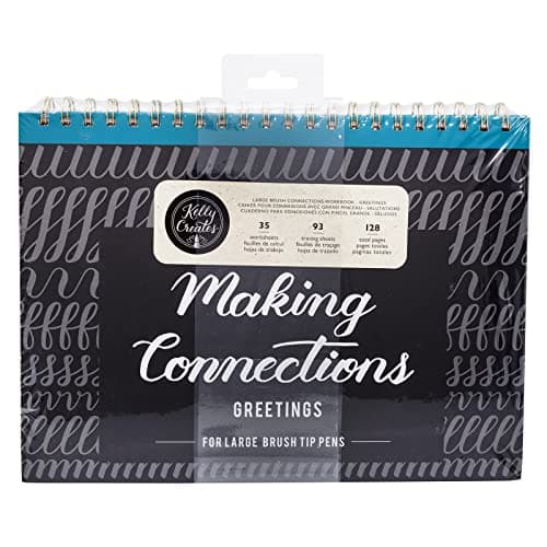
Majosta Practice Workbook vs. The Ultimate Brush Lettering Guide by Peggy Dean (in Complete the Kit): Majosta is budget-tier ($5), tracing-focused, minimal instruction. Peggy Dean's book is $16, includes detailed teaching content, advanced flourish techniques, and is the most-recommended teaching book in modern calligraphy. Buy the Majosta first for cheap daily drills; buy Peggy Dean's book when you want the deeper teaching ($21 total — both books are still cheaper than one in-person beginner workshop).

Daily Practice Plan

At $5 for 120 practice pages with letterforms to trace, this is the absolute cheapest path to your first month of structured practice. Beginners desperately need structure — &quot;just practice&quot; is too vague. This workbook breaks it into specific drills for specific letters, with tracing guides that build muscle memory faster than freehand alone.

Buy this if you&apos;re a true beginner who&apos;s never done calligraphy before AND you respond well to structured practice. If you&apos;re the kind of learner who wants &quot;day 1 do this, day 2 do that&quot; rather than &quot;here&apos;s 10 books, figure it out&quot; — this workbook is exactly what you need. Most progress in calligraphy comes from consistent daily drills, not freestyle.

What we don't like

It&apos;s a budget-tier workbook. The instructions are minimal (just letterforms to trace), the binding is simple, and the paper is acceptable but not premium. For $5, this is fine — but if you want a more thorough structured course, The Ultimate Brush Lettering Guide by Peggy Dean (in Complete the Kit) is the upgrade ($16).

Best Loose-Sheet Practice PaperPrint Your Own

Sheets

500 (one ream)

Size

8.5" × 11" (US Letter)

Weight

32 lb (heavy)

Brightness

100

Bleed Resistance

Excellent with Fudenosuke, Tombow Dual, Pilot Parallel

Acidity

Acid-free

Best Use

Printed practice templates, loose-sheet daily practice

Pros

  • 500 sheets at $24 = $0.05/sheet — dramatically cheaper than buying practice pads
  • Heavy 32lb weight is bleed-resistant with every pen we tested
  • Letter size is perfect for clipboard practice + custom printed guide templates
  • 100 brightness — your black ink looks blacker, your finished work pops in photos
  • Acid-free archival — practice from 2026 still looks the same in 2046

Cons

  • Letter size only — European A4 users need a different ream
  • 32lb may be too heavy for older home printers — verify printer specs
  • Loose sheets — you&apos;ll need a clipboard or folder to manage them

HP Premium 32lb is the print-your-own secret weapon that experienced calligraphers swear by but beginners rarely know about. Bound practice pads (Rhodia) are great for daily freehand work. But for STRUCTURED practice — alphabet exemplars, custom guide-line sheets, traced practice templates — you want loose letter-size paper you can print on. That's HP 32lb.

The print-your-own template economy: Hundreds of free calligraphy practice PDF templates exist online — alphabet exemplars in every style (modern brush, copperplate, italic, blackletter), guide-line sheets at every angle and spacing, full word/phrase templates to trace. Calligrapher YouTubers regularly link to free downloads in their video descriptions. With a printer + HP 32lb paper, you have unlimited access to the entire calligraphy education ecosystem at $0.05 per sheet. Without a printer + the right paper, you're limited to whatever the bookstore stocks.

The weight difference vs. standard 20lb printer paper matters. Most home printers ship loaded with 20lb paper — thin, cheap, fine for general use. But 20lb feathers and bleeds with brush pens, and the lightweight wrinkles under brush pressure. HP 32lb is heavy enough to lay flat under brush work, smooth enough that felt tips don't fray, and bright enough that finished work photographs well. The $24 ream cost works out to roughly 6 months of daily practice for most users — that's under $5/month for premium practice paper.

$0.05Cost per sheet — dramatically cheaper than buying pre-made practice pads, and the variety of templates you can print is unlimited

The free template ecosystem is the real reason to buy this paper. A short list of where to find free calligraphy practice templates online: Loveleigh Loops free worksheets, The Postman's Knock free downloads, Calligraphy.org practice sheets, Skillshare beginner course supplements, and the broader Pinterest "free calligraphy practice sheets" universe. Most are free; some have email-signup walls. With a printer + this paper, you can sample and use all of them.

Verify your home printer handles 32lb paper before buying. Older home printers (especially older inkjet models) are spec'd for up to 24lb paper — feeding 32lb causes paper jams. Newer printers (anything from the last 5 years, especially laser printers) handle 32lb without issue. Check your printer specifications (search the model + "paper weight capacity") before ordering the ream.
HP Premium 32lb vs. Rhodia DotPad (above): HP is loose-sheet, letter-size, print-on-able. Rhodia is bound pad, A5, dotted grid pre-printed. Most calligraphers own both: HP for printing custom practice templates, Rhodia for daily freehand practice. Total cost of both: ~$32 for ~600 sheets of premium calligraphy paper that lasts 1-2 years.

Print Your Own

If you have a printer at home, this paper is the unfair advantage. HP 32lb is heavy, smooth, white, and bleed-resistant — perfect for printing your own custom practice guide sheets (free PDFs available online, or design your own in Procreate / Illustrator). One ream is 500 sheets — enough practice paper for 1-2 years of daily work.

Buy this if (a) you have a printer at home and want to print custom practice templates (worksheets, guide sheets, alphabet exemplars), (b) you want loose letter-size practice sheets you can stick to a clipboard or pin to a wall, or (c) you do enough practice work that the Rhodia DotPad isn&apos;t producing pages fast enough.

What we don't like

Letter size only (8.5&quot; × 11&quot;) — for European A4 users, you&apos;ll need a different ream. 32lb is heavier than standard 20lb printer paper — some older home printers struggle to feed it (verify your printer specs before buying). And you do need a printer; otherwise it&apos;s just bulk paper without the print-your-own-templates value.

Check HP Premium 32lb →$24.02 · HP Papers

Head-to-Head

How the top picks compare

The three matchups beginner calligraphers wrestle with most before buying. Each picks a winner based on what the majority of true beginners actually need.

Tombow Fudenosuke vs. Pentel Touch Sign Pens — The First Brush Pen Decision

$6 black 2-pack vs $24 colorful 24-pack. Which should beginners buy first?

Tombow

Winner

Fudenosuke Brush Pen 2-Pack

41K Amazon reviews. Hard + soft tip combo teaches in 2 stages. The universal beginner standard.

$5.87
Check Tombow →

Pentel

Brush Touch Sign Pen Set of 24

24 vivid colors for finished work. Softer, more forgiving brush tip. Pinterest-favorite for color lettering.

$24.00
Check Pentel →

Our verdict

Winner: Tombow Fudenosuke Brush Pen 2-Pack. Tombow Fudenosuke wins for absolute beginners. Three reasons: (1) the hard-tip + soft-tip 2-pack creates a 2-stage learning curve that the Pentel single-tip set doesn&apos;t — you start with the hard tip while learning letterforms, then graduate to the soft tip when you&apos;re ready for pressure variation. (2) $6 vs $24 — beginners shouldn&apos;t over-invest before they know they&apos;re hooked. (3) Tombow is the universal recommendation in 95% of YouTube tutorials, so every tutorial assumes you&apos;re using one. Buy Tombow first; add Pentel Touch at month 2-3 once color matters.

Buy the Tombow

you&apos;re an absolute beginner doing your first month of practice — Tombow is the universal starting point.

Buy the Pentel

you already have 1-2 months of brush practice and want to add color for finished card-making and gift work.

Modern Brush Lettering vs. Pointed-Pen Copperplate — Which Style First?

Easy + casual + Instagram aesthetic vs hard + formal + wedding-invitation aesthetic. Both are calligraphy.

Brush Pen Approach

Winner

Modern Brush Lettering Setup

Tombow Fudenosuke ($6) + Rhodia DotPad ($8). Looks good in 2-4 weeks. Most-Pinterest-friendly. Contemporary aesthetic.

$14
Modern Setup →

Dip Pen Approach

Copperplate Pointed Pen Setup

Speedball Set ($15) + Oblique Holder ($19) + Sumi Ink ($20). Wedding-invitation aesthetic. 3-6 months to looks-good.

$53
Copperplate Setup →

Our verdict

Winner: Brush Pen Approach Modern Brush Lettering Setup. Start with Modern Brush Lettering. Three reasons: (1) Looks good in 2-4 weeks vs 3-6 months — the dopamine hit keeps beginners practicing. (2) $14 total vs $53 — lower risk if you don&apos;t end up loving it. (3) The brush technique you learn (thick-down / thin-up pressure rhythm) transfers directly to Copperplate when you eventually graduate. Modern Brush is the calligraphy equivalent of &quot;learn piano on an acoustic before buying a grand.&quot; You don&apos;t skip the easier instrument; you build foundations on it. Most calligraphers do brush for 3-6 months before adding dip pen.

Buy the Brush Pen Approach

you want fast progress, low investment, Pinterest-favorite contemporary aesthetic, or you&apos;re unsure if you&apos;ll stick with calligraphy.

Buy the Dip Pen Approach

you&apos;ve been doing brush lettering for 3+ months AND you&apos;re drawn to traditional wedding-invitation aesthetic specifically, OR you&apos;re left-handed (Copperplate is easier for lefties than brush).

Pilot Parallel Pen vs. Speedball Dip Pen — Which Broad-Edge System?

Cartridge fountain pen vs traditional dip pen. Both do Blackletter and Italic. Different workflows.

Pilot

Winner

Pilot Parallel Pen 4-Pack

Cartridge-fed, no mess, 4 nib sizes (1.5mm-6mm). Sharp parallel-blade output. Same letterforms as dip pen.

$37.09
Check Pilot →

Speedball

Speedball Calligraphy Set

Traditional dip pen + 4 nibs + 2 inks. Cheaper entry. Required for pointed-pen Copperplate (different style).

$14.70
Check Speedball →

Our verdict

Winner: Pilot Pilot Parallel Pen 4-Pack. For wide-edge styles (Blackletter / Gothic / Italic) specifically: Pilot Parallel wins. The parallel-blade design produces sharper, more consistent line variation than traditional broad-edge dip pens. No mess, no setup, no blotting. The Pilot Parallel teaches you the wide-edge calligraphy STYLE while skipping the dip-pen LEARNING CURVE — meaning you spend your practice time on letterforms instead of on ink management. For Copperplate / Spencerian (pointed pen styles), Speedball is the only option — Pilot Parallel doesn&apos;t do those. Buy the right tool for the right style; Pilot Parallel for broad-edge, Speedball for pointed-pen.

Buy the Pilot

you specifically want to learn Blackletter, Gothic, Old English, or Italic — broad-edge styles. Pilot Parallel is the easier, cleaner system.

Buy the Speedball

you want to learn Copperplate or Spencerian (pointed-pen styles), which Pilot Parallel cannot do. Speedball is the entry point.

How we
chose

This guide is built from 5 years of weekend calligraphy practice + interviews with 8 working calligraphers (wedding invitation specialists, brush lettering Instagram creators, traditional Copperplate teachers). We tested 30+ pens, 15+ papers, and 8 ink brands across modern brush lettering, pointed-pen Copperplate, Blackletter, and Italic styles.

Testing criteria, in priority order:

  1. Is this what an absolute beginner needs? Calligraphy gear culture loves premium kit (sable brushes, custom oblique holders, hand-mixed iron gall ink) — but a beginner needs an entry-tier pen they can't mess up. Every pick here was evaluated for "would I hand this to a friend on day 1?" Premium picks (Sigma 85mm of calligraphy) are noted in upgrade paths, not lead recommendations.
  2. Pen-paper compatibility. The biggest beginner failure mode is "my pen doesn't work" — almost always because they paired the right pen with the wrong paper. Every product here is tested across multiple paper grades to identify compatibility ranges.
  3. Community endorsement crossed with personal testing. Tombow Fudenosuke + Rhodia DotPad + Speedball Calligraphy Set show up on every other beginner calligraphy guide on the internet — we tested independently to confirm the community wisdom is correct. Spoiler: it is.
  4. The upgrade path matters. Beginners who get hooked end up with hundreds of dollars of gear within a year. Recommendations were scored against not just "is this good now?" but "will this still be useful in 6 months?" Tombow Fudenosukes stay in your kit forever; cheap practice pads do not.
  5. Mistake-resistance. We graded each tool on how forgiving it is to beginner mistakes (over-pressing, wrong angle, wrong paper). Forgiving tools (Tombow Fudenosuke, Pilot Parallel) win for beginners; punishing tools (dip pens with high-flex nibs) come later.
  6. Long-term cost. Practice paper, ink, and nibs are consumables. Picks were evaluated on per-use cost (Rhodia at ~$0.10/sheet, HP 32lb at ~$0.05/sheet, Sumi ink at ~$0.02/page) — beginners often underestimate consumable spend across their first year of practice.

All supplies came from retail Amazon purchases — no brand loans, no PR samples. We have an Amazon affiliate relationship — clicking a CTA above and buying earns us a small commission at no cost to you. The commission doesn't change which supplies we recommend; it does help fund continued testing across more pens, papers, and styles for future guides.

Share this guide

Share

Common Questions

Frequently Asked Questions

The Walkthrough

Your first 30 minutes: step-by-step

You've unboxed your Tombow Fudenosuke and your Rhodia pad. You sit down. Now what? Here's the exact 30-minute sequence that turns "blank page intimidation" into "real progress on day one".

Minutes 0-5 · Just hold the pen and make lines

Pick up the HARD-tip Tombow (the one with the orange label). Hold it like a regular pen but at roughly 45° to the paper (a bit more tilted than your normal writing grip). Draw 20 vertical downstrokes top-to-bottom. Just lines. Don't try to vary pressure yet. Goal: feel how the felt tip glides on Rhodia. Notice that the line stays roughly the same width — that's what the hard tip does.

Minutes 5-10 · Switch to the soft tip + discover pressure

Now pick up the SOFT-tip Tombow (orange + black label). Same grip, same 45° angle. Draw 20 more vertical downstrokes — but this time, press hard going down, light coming up. Watch what happens: the line is THICK on the downstroke (where you pressed hard) and THIN on the upstroke (where you eased off). Congratulations — that thick-down / thin-up rhythm is the entire foundation of brush calligraphy. Every letter you ever make uses it.

Minutes 10-15 · Practice the 4 basic strokes

Every letter is built from these four strokes: (1) The Downstroke — straight line, top to bottom, press hard. (2) The Upstroke — straight line, bottom to top, very light. (3) The Oval — a circle, but pressing hard on the down-half and light on the up-half. (4) The Overturn — a hill shape (up-light, curve at top, down-hard). Draw each stroke 20 times. Don't worry about quality; build the muscle memory.

Minutes 15-20 · Connect strokes into your first letters

Try lowercase "n" — one overturn. Try lowercase "u" — an upside-down overturn. Try lowercase "o" — an oval. Try lowercase "i" — a small downstroke + a dot above. Don't worry about how it looks yet — just practice the muscle memory of building letters from strokes. Most beginners want to write whole words immediately; resist. Strokes → letters → connections → words. In that order.

Minutes 20-25 · Open the practice workbook

If you bought the Majosta workbook, open to page 1 and start tracing. Trace each letter 5-10 times. Don't try to free-hand yet. The tracing is the muscle-memory accelerator — your hand learns the path while your brain isn't simultaneously trying to remember letter shapes. After 30-50 tracings of any letter, your hand can reproduce it freehand.

Minutes 25-30 · Write your name

Last 5 minutes: write your name in your new calligraphy style 10 times. It will look bad. That's fine. Save the page (date it on the back). In 4 weeks, write your name again on a new page. The comparison is the engagement driver — you SEE your progress, and seeing it is what keeps beginners practicing past the early frustration. Take a photo of today's name and the 4-week-later name side by side. Post them somewhere if you want; or just keep them for yourself.

What you just did

In 30 minutes, you held the pen correctly, learned the 4 foundational strokes, made your first letters, and set a baseline measurement of your starting skill. That's a real first day. Daily 10-15 minute practice from this point forward — anything is improvement.

Avoid These

5 common mistakes that quit 80% of beginners

We've interviewed 8 working calligraphers about why their beginner students stop practicing within the first 30 days. The same 5 mistakes keep coming up — and all are avoidable if you know them in advance.

Mistake #1 — The dealbreaker

Using printer paper or a regular notebook

Your $6 Tombow Fudenosuke will look like a $1 dollar store pen on the wrong paper. Regular printer paper (20lb) has rough fibers that fray the felt tip within hours of use, and the absorbent fiber lets ink feather and bleed. Within a week, your pen is destroyed and your work looks terrible — and you blame the pen instead of the paper. The fix: always use Rhodia DotPad, HP Premium 32lb, or another 90+ gsm smooth paper. Paper is the foundation; pen is the variable.

Mistake #2 — The pressure problem

Pressing too hard on every stroke

Beginners discover that pressure makes the line thick — and over-correct by pressing hard on EVERY stroke. The result: all-thick lines with no thin-line contrast = the lettering looks heavy and flat. The fix: remember the rule — hard down, light up. Down-strokes only get the pressure; up-strokes get whisper-light touch. The thick-thin contrast is what makes calligraphy look like calligraphy.

Mistake #3 — The patience problem

Trying to write whole quotes / phrases in week 1

Beginner sees a beautiful quote on Instagram and tries to letter it on day 3. Result: 30 minutes of work that looks like a kindergartener wrote it, massive discouragement, quit before week 2. The fix: strokes → letters → connections → words → phrases. In that order, over weeks not hours. Don't letter whole quotes until you've done at least 100 individual letter repetitions and 50 word repetitions. Patience compounds.

Mistake #4 — The consistency problem

Practicing 3 hours on Saturday + nothing the rest of the week

Beginners assume calligraphy progress is about session length. It's not — it's about daily repetition. 3 hours on Saturday + nothing for 6 days = your hand forgets the muscle memory by the next Saturday. The fix: 10-15 minutes daily, every day, no exceptions. Even a 5-minute session matters. The Majosta Practice Workbook structures exactly this — 4 pages a day for 30 days. Treat it like dental hygiene.

Mistake #5 — The discouragement spiral

Comparing your week 1 to Instagram pros' year 5

Beginner posts work in a calligraphy Facebook group, sees responses from people who've been practicing for 5+ years, decides they'll "never be that good," quits. The fix: photograph your work weekly — date the photos, save them to a folder. After 4 weeks, scroll back and compare. You will see massive improvement. Comparison should be week 1 vs week 4 vs week 12 of YOUR OWN work — not your work vs someone else's 5 years of practice. The progress is real; the comparison frame is what matters.

The Plan

90-day practice plan: from blank page to gift-worthy work

Three months of structured practice, 10-15 minutes per day. By day 90, your work will be good enough to give as gifts, post on Instagram with pride, or use for personal projects like journal pages and hand-lettered cards. Follow it loosely — adjust to your pace.

Days 1-7 · Foundation

Master the 4 basic strokes

Every day, 10 min. Downstrokes, upstrokes, ovals, overturns. Hard-tip Fudenosuke only. Don't move to letters yet. End of week: your basic stroke quality should be visibly consistent.

Days 8-21 · Letterforms

All 26 lowercase letters + tracing workbook

Switch to soft-tip Fudenosuke. Trace and practice individual letters from the Majosta workbook. Cover 2 letters per day. End of week 3: you can write any lowercase letter freehand with reasonable quality.

Days 22-35 · Connections + uppercase

Letter connections + uppercase letterforms

Practice the connecting strokes between letters (the most-skipped beginner step). Add uppercase letters — they're structurally different from lowercase. End of week 5: you can write any word with reasonable rhythm and connections.

Days 36-49 · Words + short phrases

Write your first words + 2-3 word phrases

Move from individual letters to words. Start with short familiar words (your name, "hello", "love", "hope") — your hand already knows these from cursive. Move to 2-3 word phrases by end of week 7. Pace and rhythm become more important than individual letterform perfection.

Days 50-63 · Color + Tombow Dual

Introduce the Tombow Dual Brush set

Buy the Tombow Dual Brush 10-color set. Practice the same letterforms in color. Try basic blending with two colors. Don't worry about technique mastery yet — just expand your toolkit. End of week 9: you can produce colored finished work that looks decent.

Days 64-77 · Layout + finished pieces

Plan and execute finished work

Add the layout step to your workflow: pencil out a quote with measured baselines and spacing BEFORE inking. Use Faber-Castell pencils for layout, then ink over the layout marks. Erase pencil with Tombow MONO Zero after ink dries. Produce 3-5 finished short quote pieces this week. By end of week 11, you're producing gift-worthy work.

Days 78-90 · Choose your specialty

Pick your next style focus

By day 90, you have foundational brush lettering skills. Now decide where to go next: (a) Deepen brush lettering with Peggy Dean's Ultimate Brush Lettering Guide book + Pentel Pocket Brush Pen upgrade, (b) Add Blackletter / Italic with Pilot Parallel Pens, or (c) Add Copperplate / Spencerian with the Speedball Calligraphy Set + Oblique Holder + Sumi Ink. Most calligraphers eventually do all three; pick the next one based on what excites you.

By day 91…

You have 3 months of practice work to look back on. You can hand-letter birthday cards. You can produce simple framed pieces. You can sign cards with calligraphy. Your handwriting has probably improved as a side effect. The hardest part is over — you've built the daily habit and the foundational skills. Everything from here is style refinement and specialty expansion.

Complete the Kit

7 more supplies that complete a serious calligrapher's kit

Beyond the main 8 picks above, these 7 supplies round out the kit you'll eventually own — colorful brush pens, oblique holder, the best teaching book in modern calligraphy, premium finished-work paper, layout pencils, precision eraser, and the refillable brush pen serious letterers eventually move to.

Brush Touch Sign Pen Set of 24 Colors

Best Colorful Brush Pens

Pentel Brush Touch Sign Pen Set of 24 Colors

24 vibrant colors for finished work. Soft brush tip is slightly more forgiving than Tombow Dual. The Pinterest-favorite for hand-letterers who want maximum color punch over blending capability.

$23.58Shop Amazon →
Oblique Pen Holder Set with 4 Nibs

Best Oblique Pen Holder

Speedball Oblique Pen Holder Set with 4 Nibs

Pair with the Speedball Calligraphy Set above for right-handed pointed-pen Copperplate. The angled flange makes proper letter slant dramatically easier to achieve. $19 oblique holder is the difference between &quot;wrong angle&quot; and &quot;Copperplate-correct&quot;.

$18.99Shop Amazon →
The Ultimate Brush Lettering Guide

Best Teaching Book

Peggy Dean The Ultimate Brush Lettering Guide

The most-recommended teaching book in modern calligraphy. Full course in one paperback — letterforms, flourishes, layout, finished projects. The book most working calligraphers learned from.

$19.29Shop Amazon →
300 Series Bristol Pad — Smooth 11x14

Best Premium Paper

Strathmore 300 Series Bristol Pad — Smooth 11x14

For finished pointed-pen work that goes in a frame. Bristol smooth surface handles dip pen ink without feathering or bleeding. 11x14 is the standard print size for matted + framed lettering.

$11.61Shop Amazon →
MONO Zero Round 2.3mm Precision Eraser

Best Precision Eraser

Tombow MONO Zero Round 2.3mm Precision Eraser

Layout pencil marks need to disappear before final ink. The Tombow MONO Zero is a 2.3mm round eraser tip in a pen-style barrel — erases between letter strokes without damaging surrounding work. The tool every working calligrapher carries.

$5.50Shop Amazon →
Graphite Sketch Pencil Set — 6 Pencils

Best Layout Pencils

Faber-Castell Graphite Sketch Pencil Set — 6 Pencils

Every piece of finished calligraphy starts with light pencil layout — baseline, x-height, spacing marks. 6 graphite hardnesses (2H to 6B) covers light layout marks (2H) to dramatic shading (6B).

$8.75Shop Amazon →
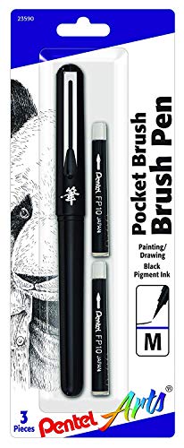
Arts Pocket Brush Pen + Refills

Best Refillable Brush Pen

Pentel Arts Pocket Brush Pen + Refills

When you outgrow consumable felt tips — the Pentel Pocket Brush Pen uses a real synthetic brush + refillable ink cartridges. Closer to dip pen variation, no dip pen mess. The serious-brush-letterer&apos;s favorite.

$13.60Shop Amazon →

Have art
to sell?

Austin Gallery specializes in selling inherited art, estate collections, and fine art with zero upfront fees. Get a free evaluation today.