Lighting Guide · Updated June 2026
How to Light Artwork at Home: Angles, Distance, and Color Temperature
Good art lighting is the difference between a piece that glows and one that looks flat, glary, or quietly fading on the wall. The rules are simpler than gallery folklore makes them sound — three numbers handle most of it.
By the Austin Gallery editors · June 13, 2026
Light art from a 30-degree angle to kill glare, use 2700–3000K warm-white bulbs with a high color-rendering index (CRI 90+), and keep light levels modest to protect the work. That trio handles 90% of home art lighting. Everything else — fixture choice, distance, when to spend on UV protection — is refinement on top of those three decisions. The principles below come from museum and gallery lighting practice, scaled down to a living-room wall.
What angle should I light artwork from?
Aim the light at a 30-degree angle from vertical — steeper causes glare bouncing straight back at the viewer, and shallower casts the frame's shadow across the art. Thirty degrees is the long-standing gallery starting point because it lets the beam graze the surface evenly without reflecting off glass or glossy varnish into the eye. If the piece is textured — heavy impasto, a deckled paper edge — you can steepen slightly to rake the surface and reveal that texture; if it's behind glazing, stay close to 30 degrees and adjust until the hot reflection disappears from your normal viewing spot.
What color temperature is best for art?
Use 2700–3000K (warm white) for most art; push to 3500–4000K only for cool-toned or highly detailed work. Color temperature is measured in kelvin (K): lower numbers are warmer and more amber, higher numbers are cooler and bluer. Warm white at 2700–3000K reads as inviting gallery light and flatters the warm pigments in oils, wood frames, and most prints. Reserve the crisper 3500–4000K range for photography, cool-palette abstracts, or technically detailed pieces where a neutral light helps the eye resolve fine work. Avoid anything above 4000K for art — daylight-blue light makes most pieces look clinical and washed out.
Why does CRI matter for art lighting?
Choose bulbs with CRI 90 or higher so colors render true. Color-rendering index (CRI) is a 0–100 score of how faithfully a light source shows an object's real colors compared to natural light. A cheap bulb at CRI 80 can leave reds looking muddy and skin tones in a portrait looking grey, no matter how bright it is. Galleries and museums specify high-CRI sources precisely because a painting's color relationships are the artwork — get the CRI wrong and you're looking at a distorted copy. For art at home, treat CRI 90+ as a hard minimum and ignore brightness claims until that box is checked.
Which light fixtures work best for art?
Match the fixture to the wall, not the other way around. Four options cover almost every home:
Picture lights mount directly to the frame or the wall just above it — the classic intimate look, best for a single hero piece. Track lighting uses adjustable heads on a ceiling rail and is the most flexible for a gallery wall or rotating display, since you can re-aim each head. Recessed wall-washers sit in the ceiling and bathe a whole wall in even light — clean and architectural, but harder to retrofit. And LED is the default light source across all of them because it emits almost no UV or heat — the two things that fade and damage art. We compared the best plug-in and battery options in our guide to art lighting under $200.
Gear we'd reach for
Fixtures and bulbs that hit the angle, warmth, and CRI above. Affiliate links — we may earn a commission, at no cost to you.
 Cocoweb 16-inch Tru-Slim Brass LED Picture LightCRI 90+ at a warm 3000K so colors read true above a single hero piece.View on Amazon →
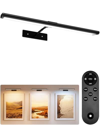 EZVALO Rechargeable Cordless Picture LightBattery-powered with a remote — no outlet or wiring to hit the 30-degree angle.View on Amazon →
 WAC Lighting Charge 3-Light LED Track KitThree aimable 90+ CRI heads at 3000K for a gallery wall — re-aim each to 30 degrees.View on Amazon →
How far should the light be from the art?
Mount a picture light or track head at roughly the distance recommended for the art's height, then adjust until the beam covers the piece evenly. For a picture light, that usually means a fixture whose arm length and projection are sized to the frame so the beam reaches the bottom edge without leaving the top in shadow — taller pieces need the light mounted higher and projecting farther out. For track or recessed heads, the rule of thumb is to place the fixture out from the wall by about a third of the ceiling height and aim it at the center of the piece; that lands the beam near 30 degrees naturally. Then trust your eyes: stand where you'll normally view the art and nudge the fixture until the light is even and the glare is gone.
How do I protect art from fading?
Keep light levels low for works on paper — UV and heat fade pigments, and the damage is cumulative and permanent. Museums hold light-sensitive works (watercolors, prints, drawings, textiles, photographs) at around 50 lux, a deliberately dim level, precisely because every hour of bright light spends a little of the work's lifespan. At home you won't run a light meter, but the principle scales: dimmer is safer for anything on paper, and a dimmer switch is one of the best investments you can make for a valued piece. The companion rule is the light source itself — never aim a hot, high-UV light at original art; LED is the safe default because it emits almost no UV or heat. Halogen and incandescent bulbs run hot and push UV; both accelerate fading. Pair low-UV LED light with UV-filtering glazing for anything that matters — our museum glass framing guide covers when that upgrade earns its cost.
What about natural light?
Never hang valuable art in direct sunlight. Daylight is the most intense UV source most homes have, and a sunbeam tracking across a piece will fade it faster than any lamp. Indirect, north-facing daylight is lovely and relatively gentle, but a wall that catches direct afternoon sun — common in Texas homes — is the worst place for anything on paper or any vibrant pigment. If the only good wall gets direct sun, treat the glazing as non-negotiable: UV-filtering glass or acrylic, plus sheer shades or film on the window. For truly irreplaceable work, keep it off sun-struck walls entirely.
Color temperature by art type
A quick reference for matching kelvin to the work. When in doubt, 3000K is the safe default that flatters nearly everything; only move off it for a specific reason.
| Art type | Recommended kelvin | Why |
|---|---|---|
| Warm-toned paintings / wood frames | 2700K | Flatters warm pigments and natural wood |
| Most art (the default) | 3000K | Balanced warm-white — safe for nearly everything |
| Detailed / cool-toned art / photography | 3500–4000K | Crisp neutral light renders fine detail |
| Light-sensitive works on paper | Low lux + LED | Minimizes fading from UV and heat |
Ranges reflect museum and gallery lighting practice scaled to home use. The ~50 lux figure for light-sensitive works is the widely cited museum standard for fragile media on paper. Treat these as starting points and trust your eye in the actual room.
Common mistakes to avoid
Lighting from straight on. A light aimed flat at glazed art reflects a glare spot right back at the viewer. The 30-degree rule exists to solve exactly this — if you see a hotspot, the angle is wrong.
Buying on brightness, ignoring CRI. A bright bulb at CRI 80 will misrepresent your art's colors. Check CRI 90+ first; brightness second.
Using hot halogen on originals. Halogen and incandescent bulbs throw UV and heat that fade and dry out art over time. LED is the safe default, full stop.
Over-lighting works on paper. Watercolors, prints, and photographs are the most light-sensitive things on most walls. Dimmer is safer; a dimmer switch pays for itself.
Hanging it wrong before you light it. Lighting only works if the piece is at the right height to begin with — our guide to how high to hang art covers the center-line rule that pairs with everything here.
The bottom line
Aim the light at 30 degrees, run warm-white LED at 2700–3000K with CRI 90 or better, and keep the levels gentle on anything that fades. The best art lighting is the kind you never notice — you just see the art, evenly lit, glare-free, and aging slowly. Get the angle, the kelvin, and the CRI right, and the rest is a dimmer switch and a few minutes of nudging the fixture until it looks right from your favorite chair.
Guidance reflects museum and gallery lighting practice and standard lighting-industry references — the 30-degree aiming angle, 2700–3000K warm-white range, CRI 90+ for color fidelity, the ~50 lux museum standard for light-sensitive works, and low-UV/low-heat LED as the conservation default. Compiled by the Austin Gallery editors as of June 2026; conditions in your home will vary. Austin Gallery may earn a commission from links on this page at no cost to you.